Eduardo came in as All-Around Fitness. The brand wasn't wrong, it just wasn't doing the work it needed to do. His audience is both men and women, and the brand had to feel grounded without going full "gym bro," and warm without reading as a women's wellness brand. Most designers pick a lane. The brief was to not pick a lane.
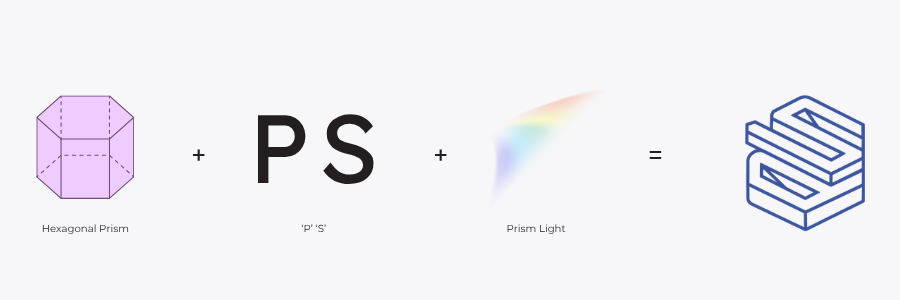
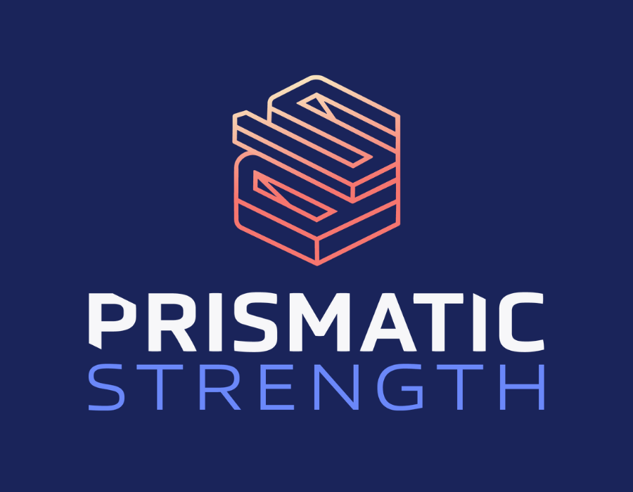
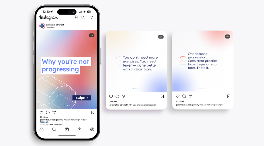
Rachel's Bold Foundation session sharpened Eduardo's positioning and produced the new name: Prismatic Strength. The idea: Eduardo doesn't build one-dimensional athletes. Strength, mobility, and control in every direction, like light going through a prism.
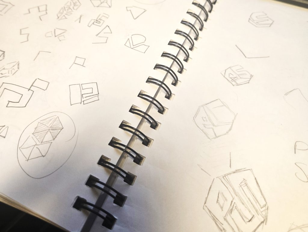
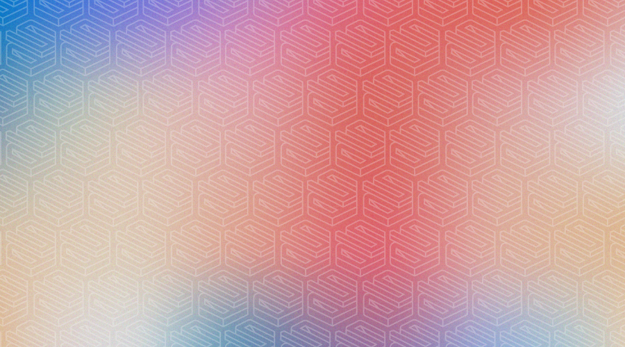
I give every client a curated noun list to pull from. The prism concept came from that process and ended up being genuinely hard to execute. I wanted a 3D form that felt minimal and intentional, not decorative. The gradient was the key decision: it needed to suggest light entering and refracting, not just add color. The palette took the most rounds. Too soft and it reads as a wellness studio. Too hard and it reads as a supplement company. The final palette lives in the space between.
"I love the colors. I love how you're able to take what I said that I couldn't articulate well and put it into something I was very, very happy about."