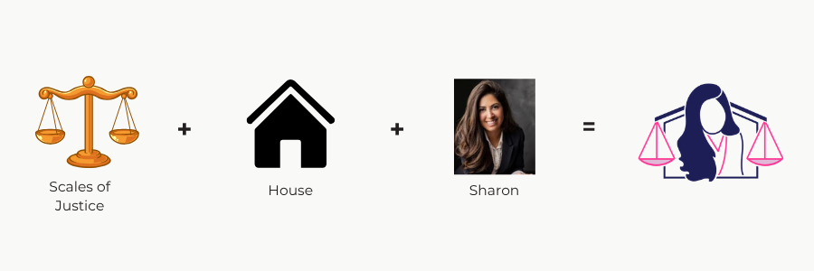
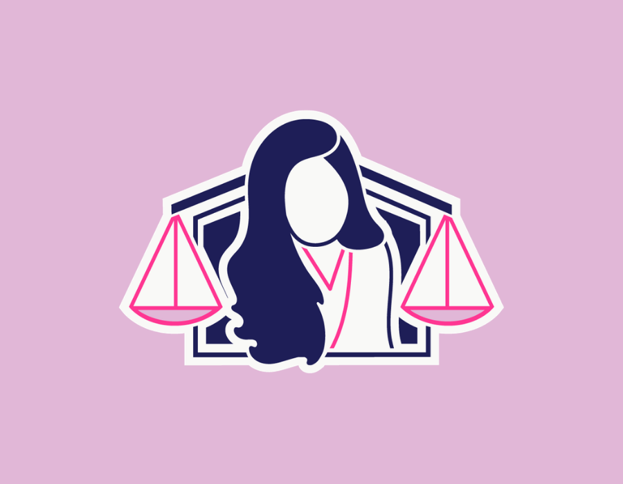
Sharon was launching her own brokerage after years as an Oceanside agent with a legal background. The challenge was fitting three things into one mark: a specific person, a real estate foundation, and a lawyer's precision. Most real estate brands pick one. The brief was to hold all three.
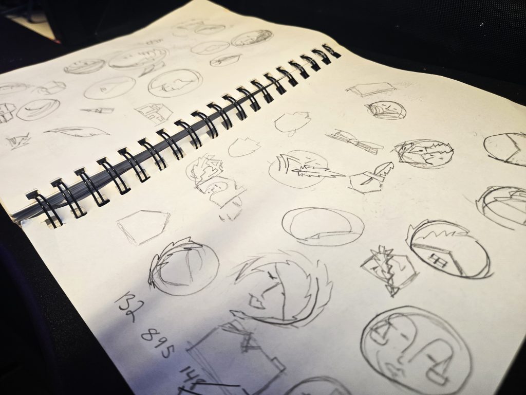
I give every client a curated list of nouns, words with visual symbolism that connect to their brand, and they choose the ones that resonate most. Sharon chose the scales of justice and a house silhouette. She also messaged me separately saying she liked the idea of a person writing in a notebook. My first thought: I don't know how to put a whole event in a logo. But I kept working.
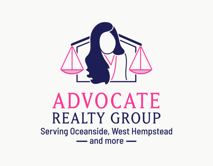
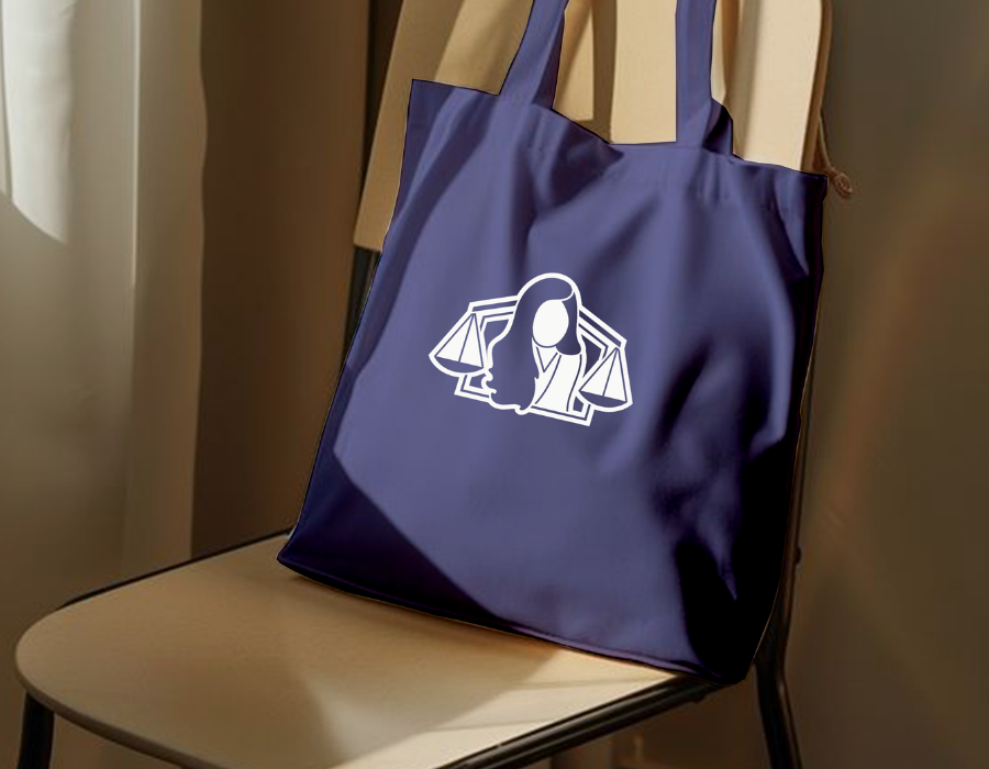
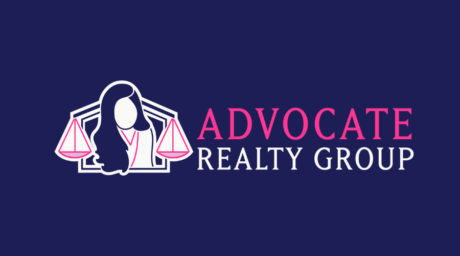
What I landed on: Sharon's actual silhouette, her long hair and blazer, framed by a roofline that extends outward and transitions seamlessly into the arms of a set of justice scales. The same continuous line that defines a home holds the weight of legal precision. Nothing decorative. Everything connected.
"You did a fantastic job blending everything and really sending that message across of what I do and who I am in one little picture."